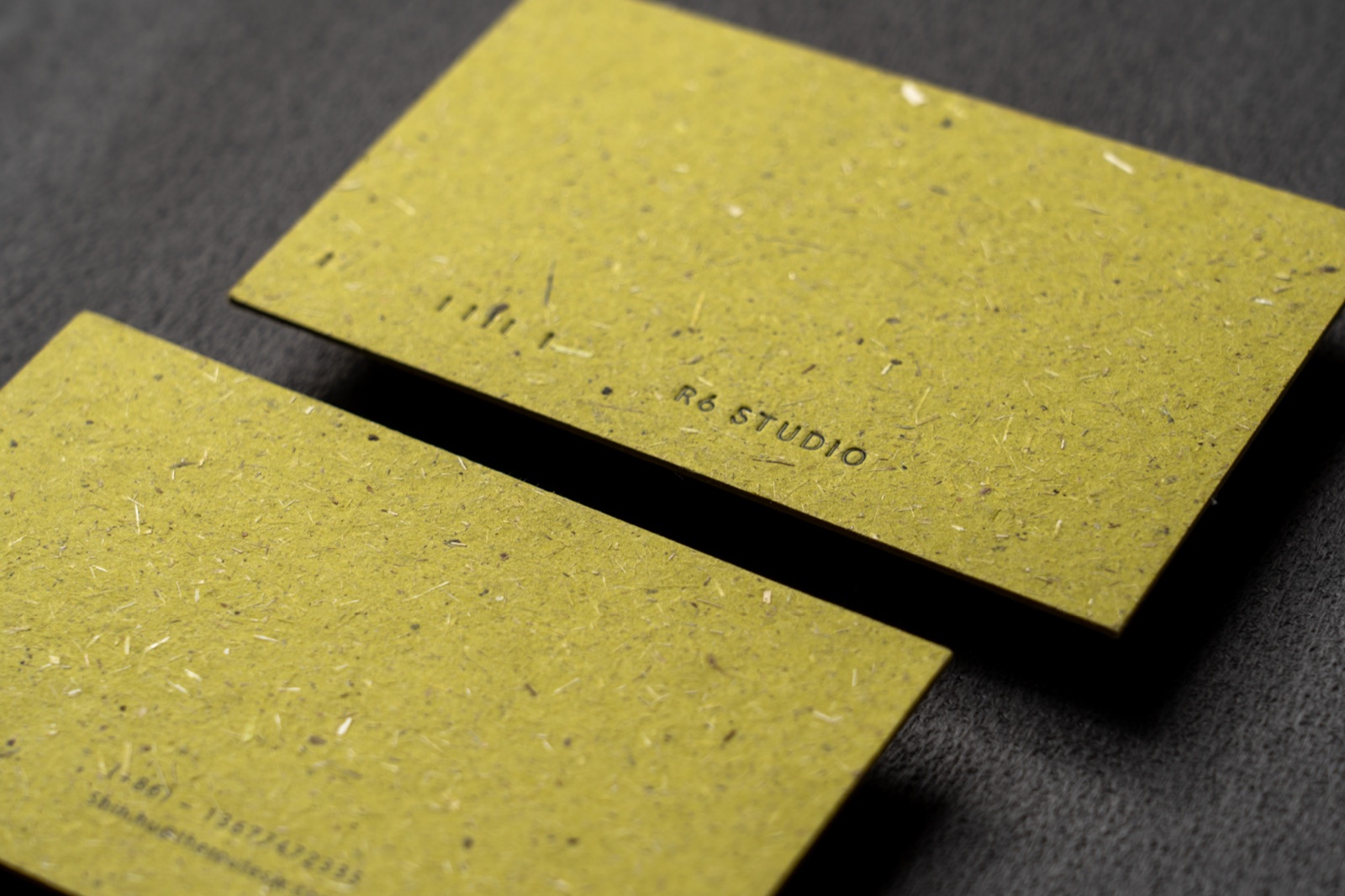
Begin with touch.
Compare texture, thickness and the character of a surface.
 Lacquera漆域
LACQUERA / 漆域
Lacquera brings together paper selection, design direction and print finishing for identities that deserve a thoughtful introduction.
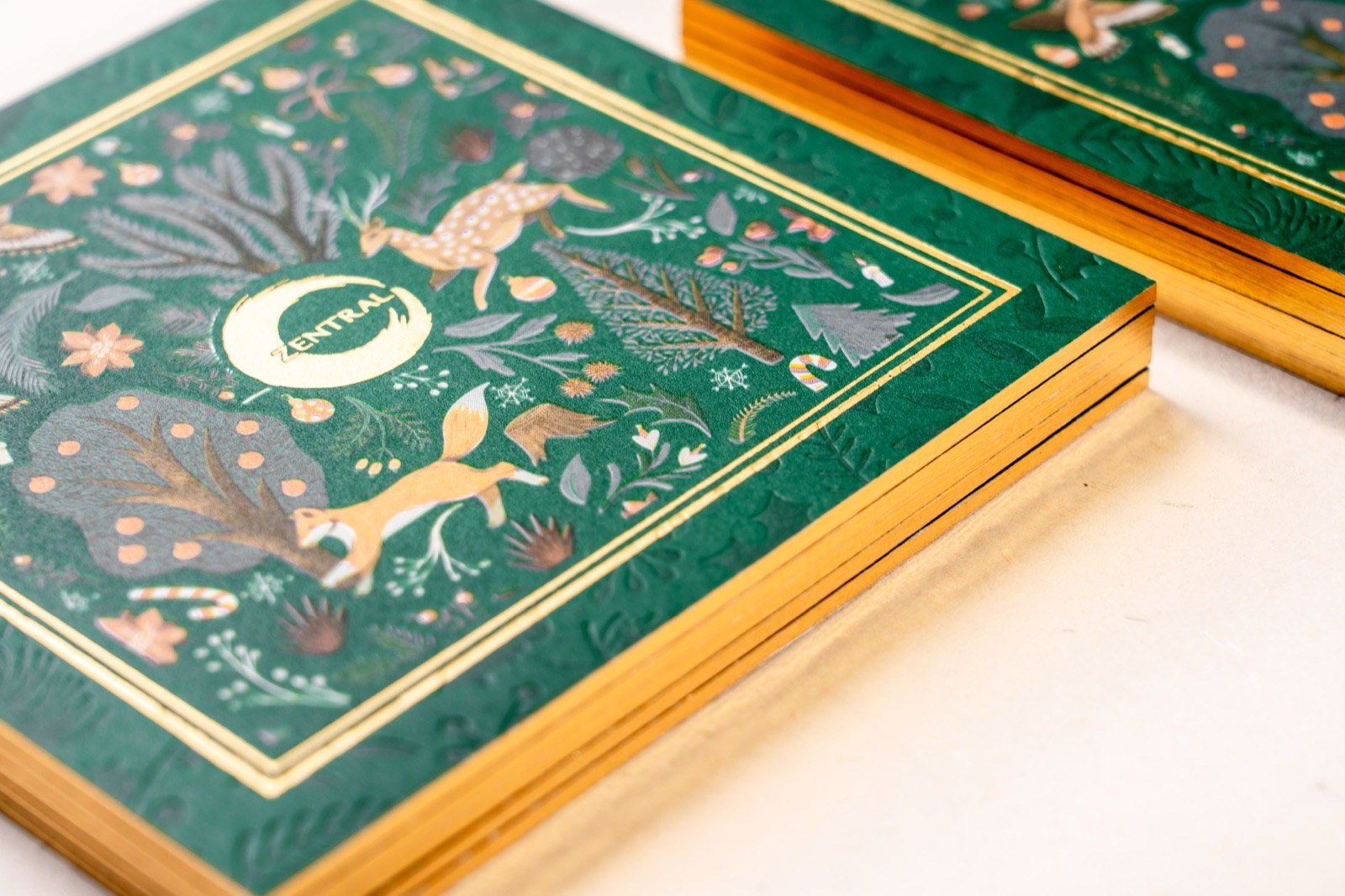
A business card is held, turned, and passed from one person to another. Its weight, surface and smallest details all contribute to that moment.
We start with your identity and work through the paper, colour, printing and finish together. The result should feel like it belongs to your brand.
Our project process↗Compare texture, thickness and the character of a surface.
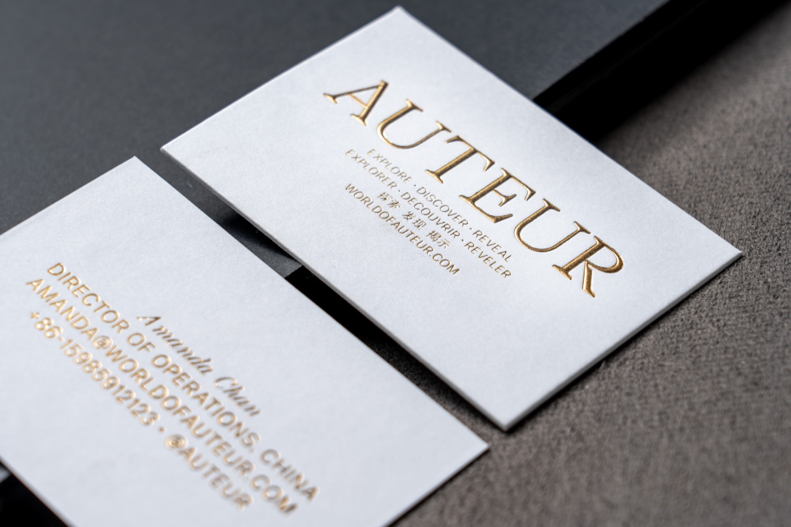
A small foil mark or quiet impression can shape the whole.
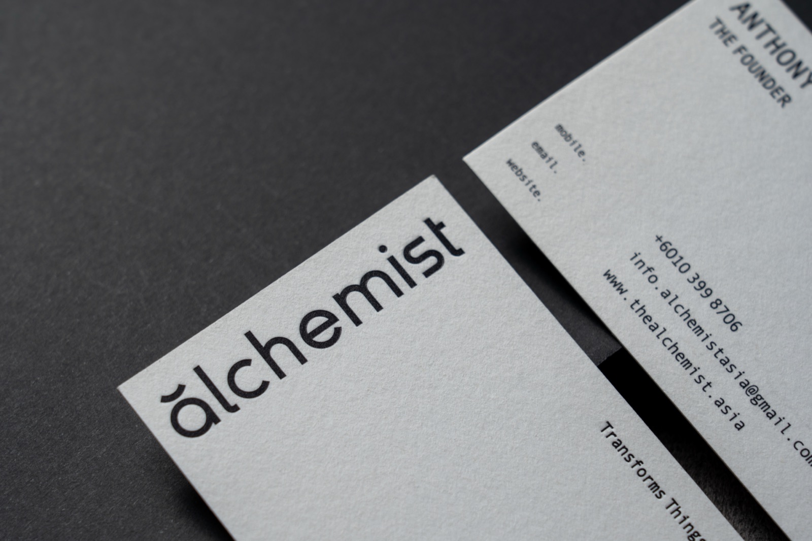
Give your name, message and design the space they need.
Selected brands from projects our team has contributed to, including work before Lacquera.